
As you probably know, I'm a huge fan of Asana. It's my favourite task management tool and I recommend it to anyone who's after an easy to use and powerful project management tool.
As you can imagine, I was stoked when the team at Asana reached out to me to give me a sneak peak at the new design. I've been using a private beta of the platform for the last couple of weeks and I have to say, I highly approve of the changes.

Under the hood, the core functionality of the app is pretty much the same and it's still very familiar and easy to use. There have been some slight changes, for example it's quicker and easier to set due times and set tasks to repeat. The task pane is now collapsed when you navigate to a project making the screen feel less cluttered. The Asana team is also working on improving the speed of the app which is always a good thing.
 On the surface, the entire app has been redesigned and reimagined. It now feels sleeker and much more modern; A tool you can be really proud of using. I love the brighter colours and stylish new navigation bar. The colour really does make a massive difference. The whole app feels a lot more fun which means you check back in with it on a more frequent basis.
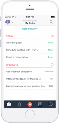
The iOS and Android apps have both received a design overhaul. Similarly, they now feel much cleaner and are more satisfying to use. One of the subtle changes I really like is the differentiation between custom sections that I create and the default sections in the My Tasks view. Like the desktop app, I really enjoy the new colours and fun aspect of the app; it looks good and adds more clarity to the app.
Asana are giving away free t-shirts to anyone who is willing to spread the word about the #newAsana on Twitter. Read more about how to get your free t-shirt on the Asana blog.
You can read more about the #newAsana on the here.
Good job Asana – Love the update!